OCR Companion App
Branding - UI/UX
2024
Problem
On-Chain Records specializes in blockchain enabled NFC-chipped vinyl records. While customers can scan their records individually to access exclusive content, they couldn't access all of their records' digital content in one central place, leading to a large UX issue. To address this, I proposed the creation of an official On-Chain Records mobile app.
Process & Solution
I was responsible for user research, competitive analysis, low-high fidelity wireframing and prototyping. Through iterative testing, I also refined the design for usability and aligned it with the brand's visual identity for a cohesive user experience.
What is On-Chain Records?
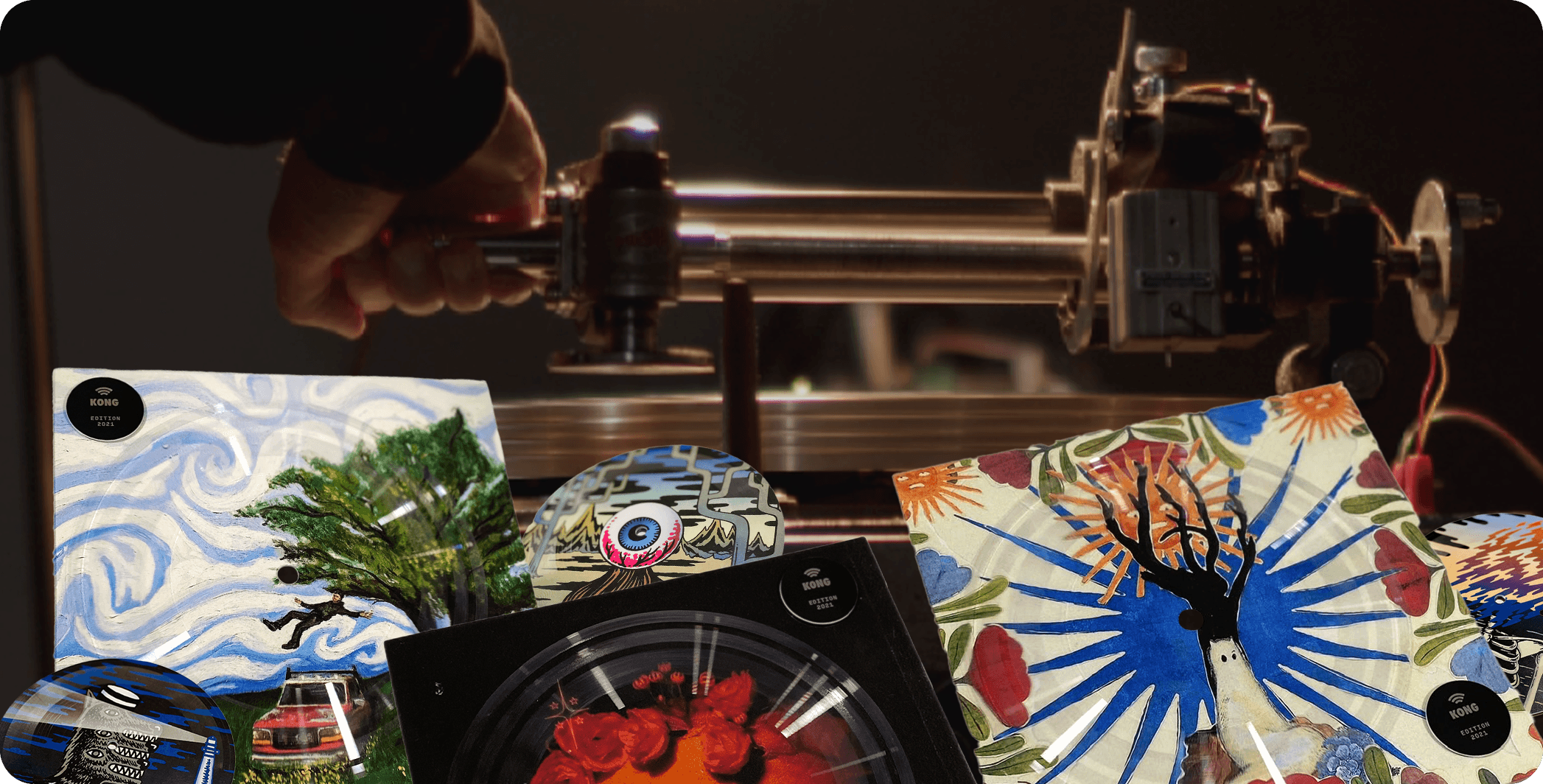
On-Chain Records was founded in 2021 with the vision of better connecting artists with fans by utilizing an iconic medium - vinyl records. To do this, OCR combines a blockchain-enabled NFC chip with lathe cut vinyl records. Each record not only has music physically engrained in the record but also unique digital content that can range from audio files to more interactive elements. Simply hold the record up to any NFC compatible device, such as a phone, and directly access the content on the vinyl.
User Research
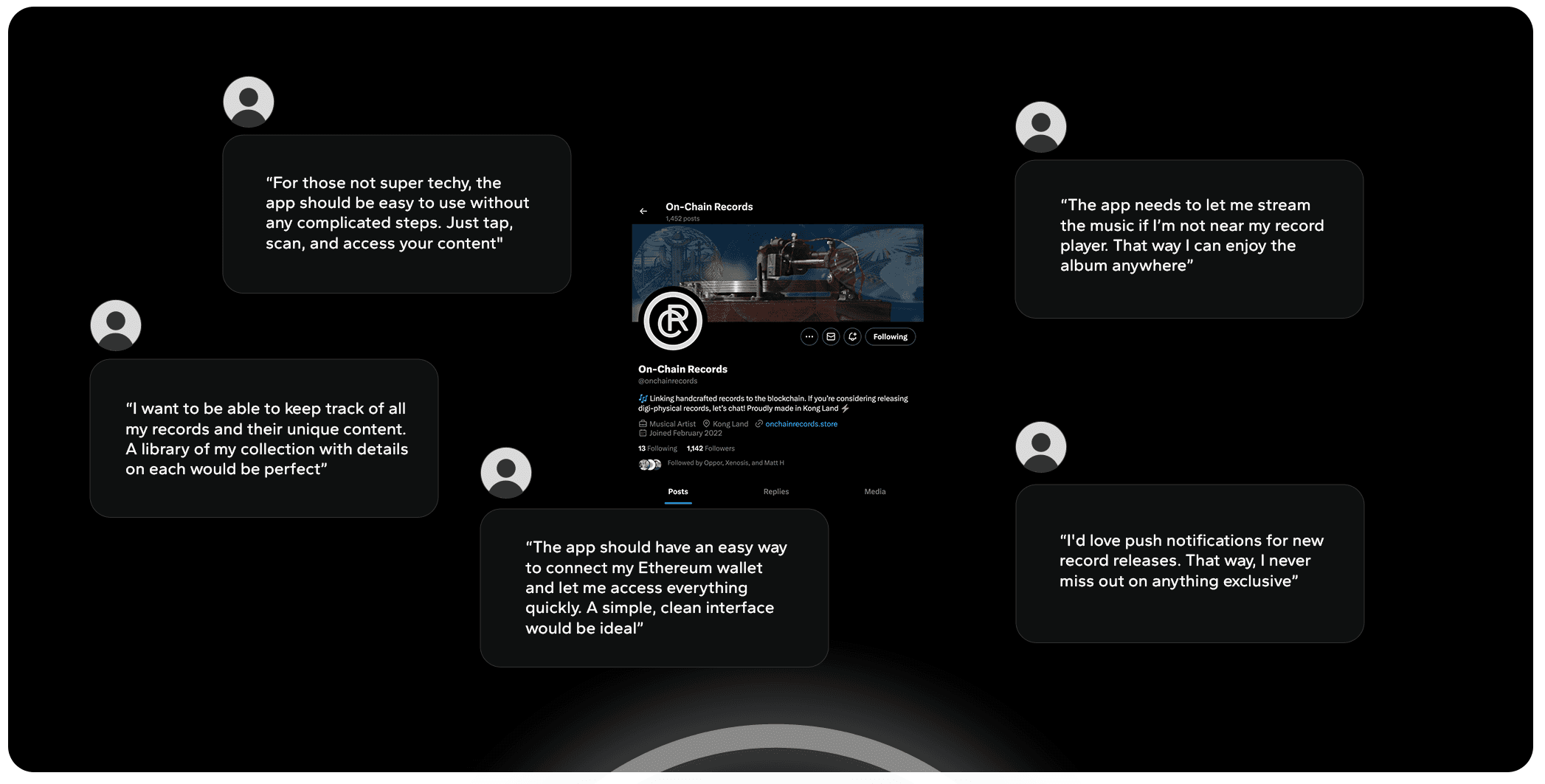
I began by conducting multiple surveys and Q&As on the official socials of OCR - X (Twitter) & Discord - to gauge what challenges that customers were personally facing when it came to the records and the goals that they have. If there was an OCR app, what would they like to see be part of it? These were in the form of free response questions as well as polls regarding the customer experience itself.
To validate the takeaways from my research I analyzed internal existing data to gain a deeper understanding of the community. This data included insights into known customer motivations, tendencies, and common complaints. By examining this information, I identified patterns and recurring themes that shed light on the core customer's needs, preferences, and challenges. This reaffirmed a desire to have a more streamlined process of purchasing and a center for all their records in one place.
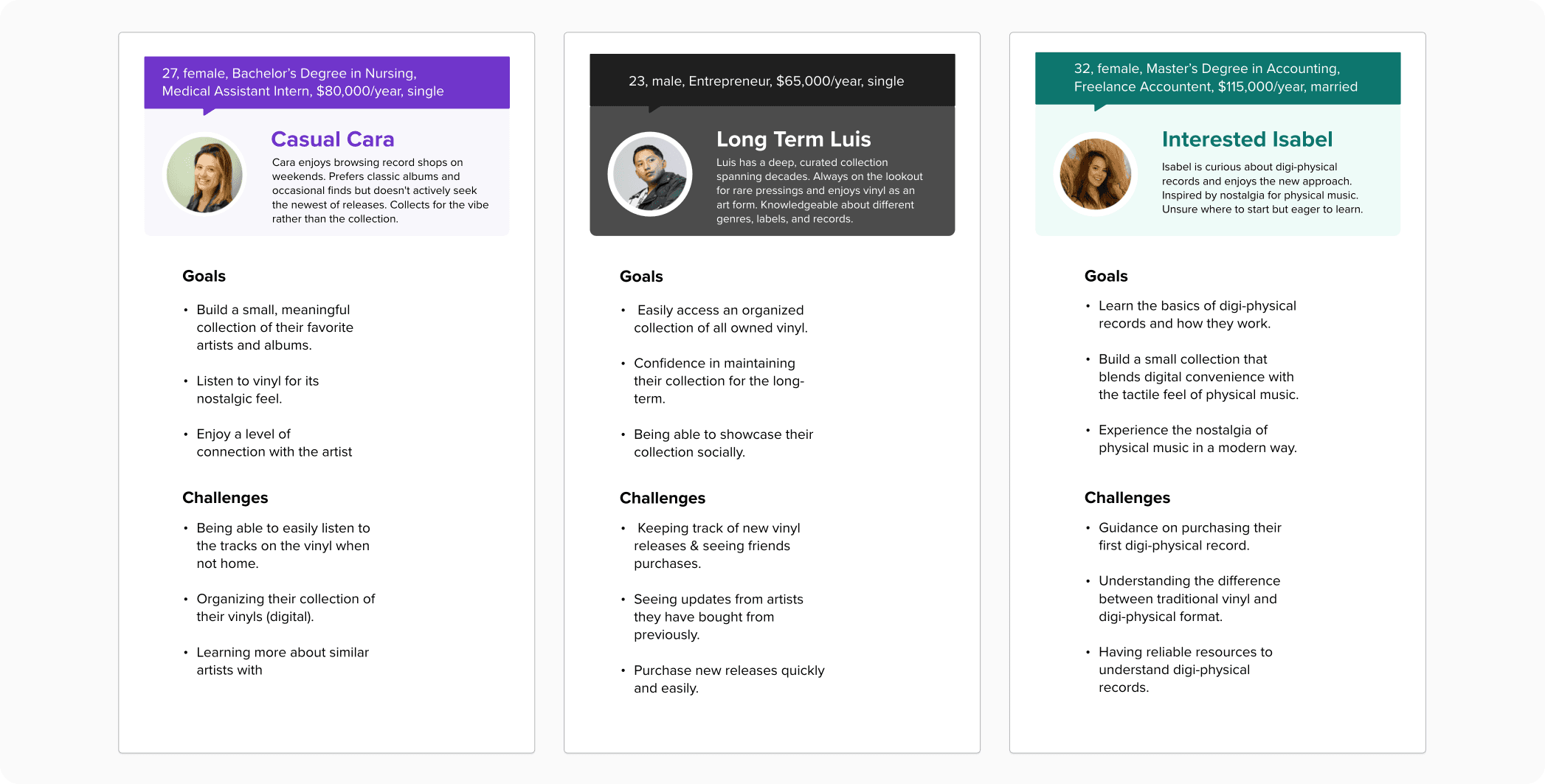
From my research I crafted personas that reflected the customers I would be creating the app for. This helped to pull together what I learned so far into potential users who I would be designing for. For example, the casual collector who just wants to connect with/appreciate their favorite artists and more serious collectors who lean towards being a completionist.
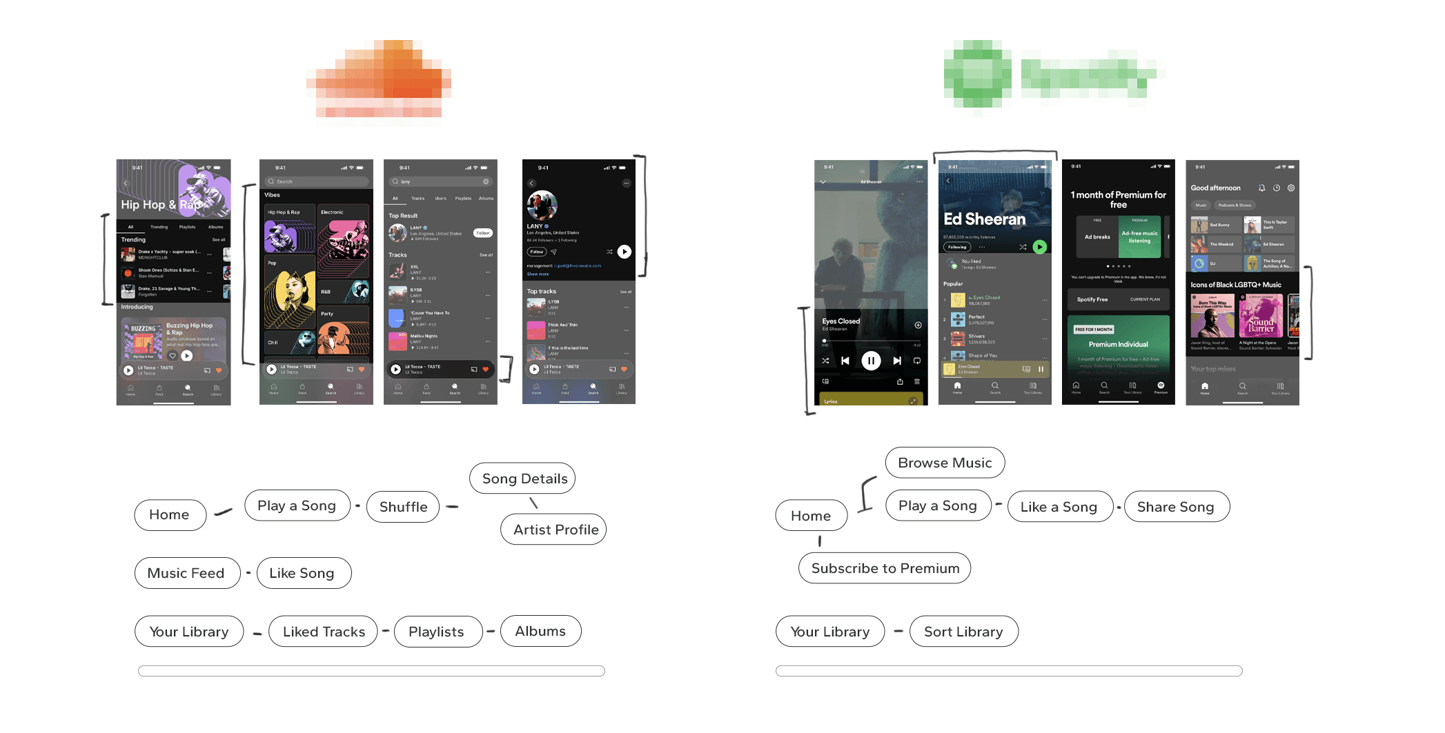
While there are no brands directly like OCR, I took it to myself to study similar apps such as SoundCloud & Spotify. Understanding how they organize their app and user flows when it came to music, accessing content, etc. helped provide strong insights for how I could approach the same process. From here I began visualizing how navigation would translate within the OCR app.
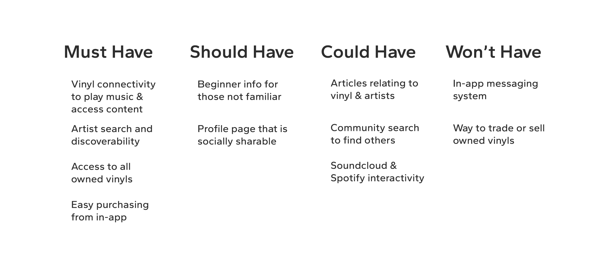
I then created an MVP to directly address the user's primary needs and pain points. By stripping the app down to its core functionalities, I could efficiently implement a lot of the features that would benefit users before focusing and looking into additional features. This approach allowed me make meaningful, informed decisions based on my research, ensuring the final product would have a foundation that aligned with user expectations.
Wireframes & Prototyping
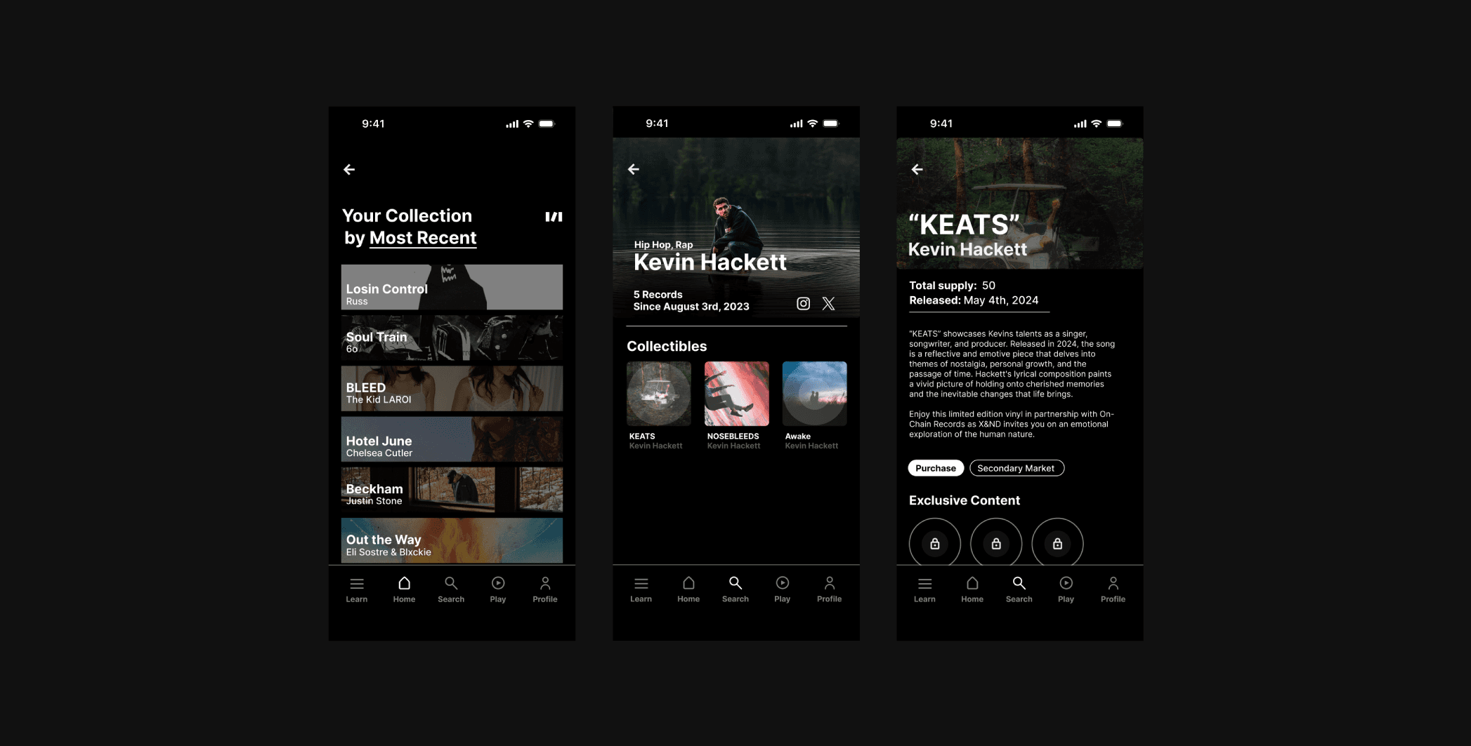
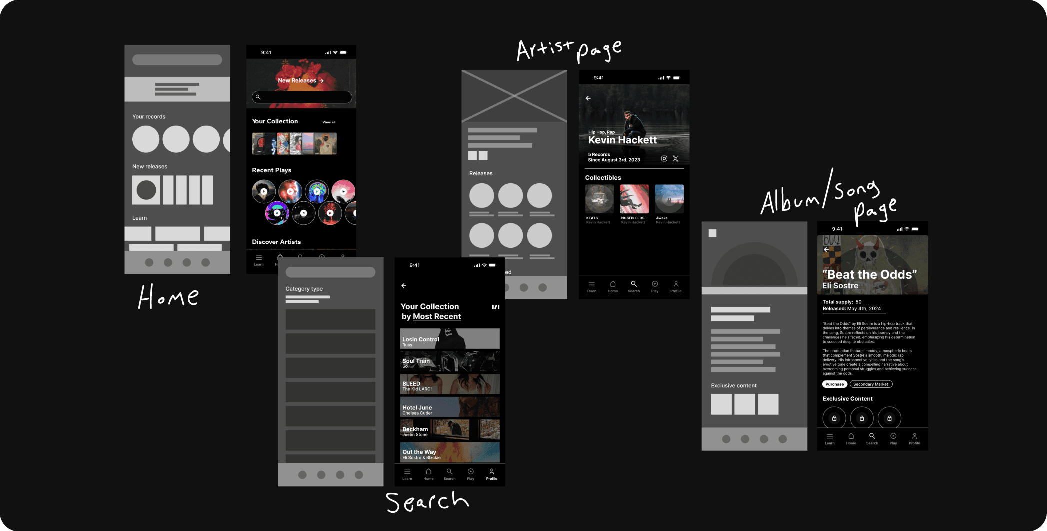
My rough wireframing started with establishing important pages and the flows between each. This initially allowed me to focus on the layout and functionality without the distraction of visual design. Once those were finished I moved to high fidelity, implementing branding, and starting to prototype. A functioning prototype helped identify usability issues early on, reducing timely revisions later and ensuring the final design was both functional and user-centered.
Feature Highlights
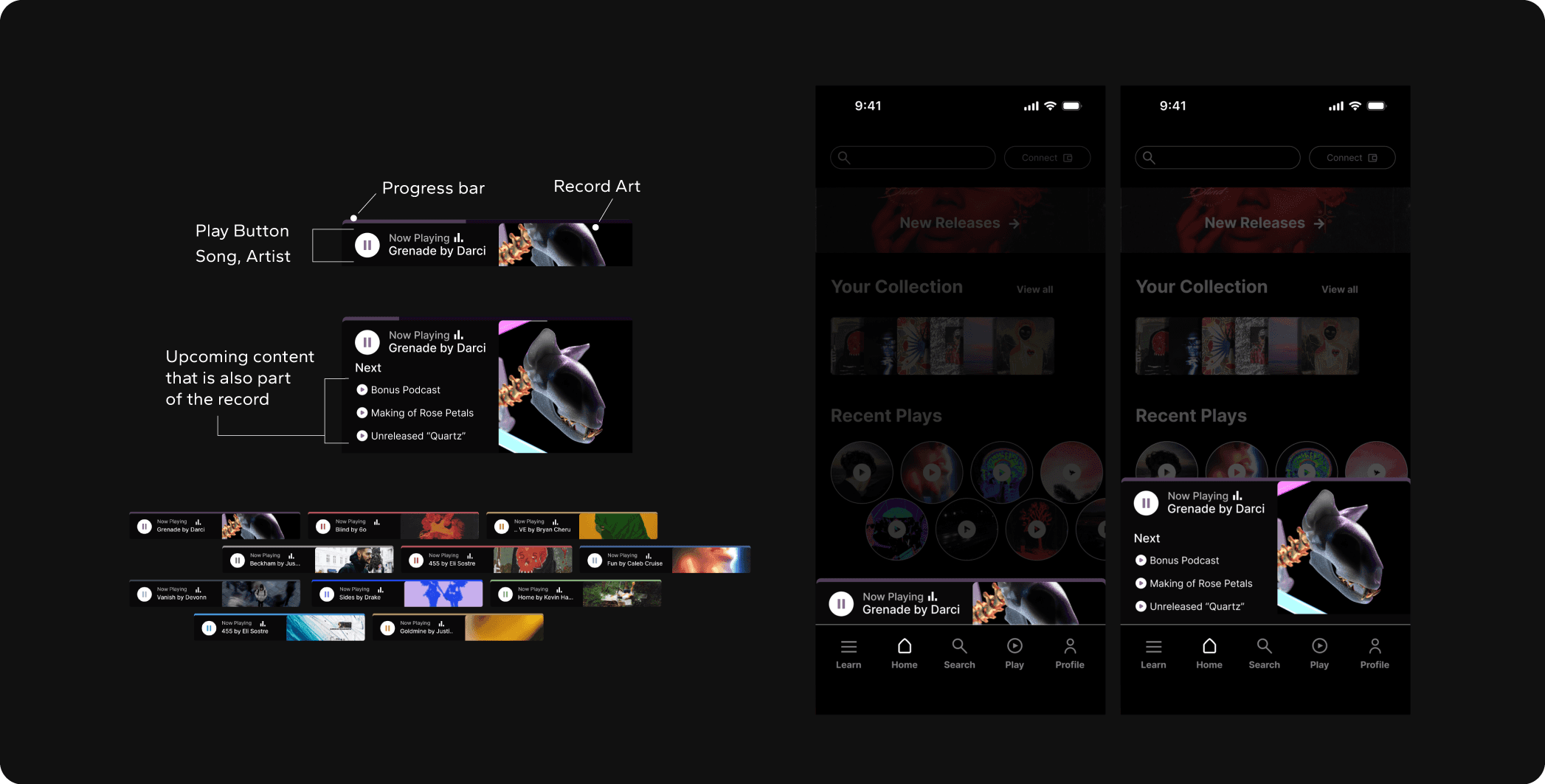
An Important component I created between low and high fidelity wireframing is the content player. This proposed solution addressed an issue of not being able to access a records content when not at home. This player allowed for interacting with all audio files on the record whether scrolling in or out of the app.
User Testing
Once the prototype was finalized with certain flows, I tested it internally with the OCR team as well as established supporters. Feedback was given, such as making the login experience simpler for new users, and implemented into additional prototype versions. Ultimately a prototype was decided on to publicly test with the community which got positive reactions and enthusiasm for an official release.
Final Outcome
The project resulted in a high-fidelity prototype of a companion app that enhances the experience of those who purchase their records from OCR. The app allows users to directly purchase records, manage and view their collection, interact with record-specific content, and explore new artists and vinyl releases. User testing showed that the app expanded upon the current experience by seamlessly allowing a lot of the actions they take to happen in one place.
Takeaways
Core Community is Key: Initial surveys and Q&As revealed what the customer value most—interactivity, collection management, and a seamless experience. Understanding these priorities shaped the app’s core features, ensuring they aligned with user goals.
Branding is Powerful: Feedback from sharing the prototype revealed that users felt more comfortable using the app due to being familiar with the "OCR aesthetic" and that it "felt like an actual OCR app" which told me that effectively translating branding into new products has an overall positive impact especially on existing customers.
Prototypes Reveal Issues Early: By testing early prototypes by myself I was able to discover issues with certain flows that I didn't see in my early wireframing. From this I learned that prototypes not only serve a purpose in their final stages but are effective even in their early stages.
