Clearcycle App
Branding - UI/UX
2024
Results
Increase in likelihood to consistently recycle
Increased confidence in what and how to recycle
Quicker and user friendly process to recycle
Problem
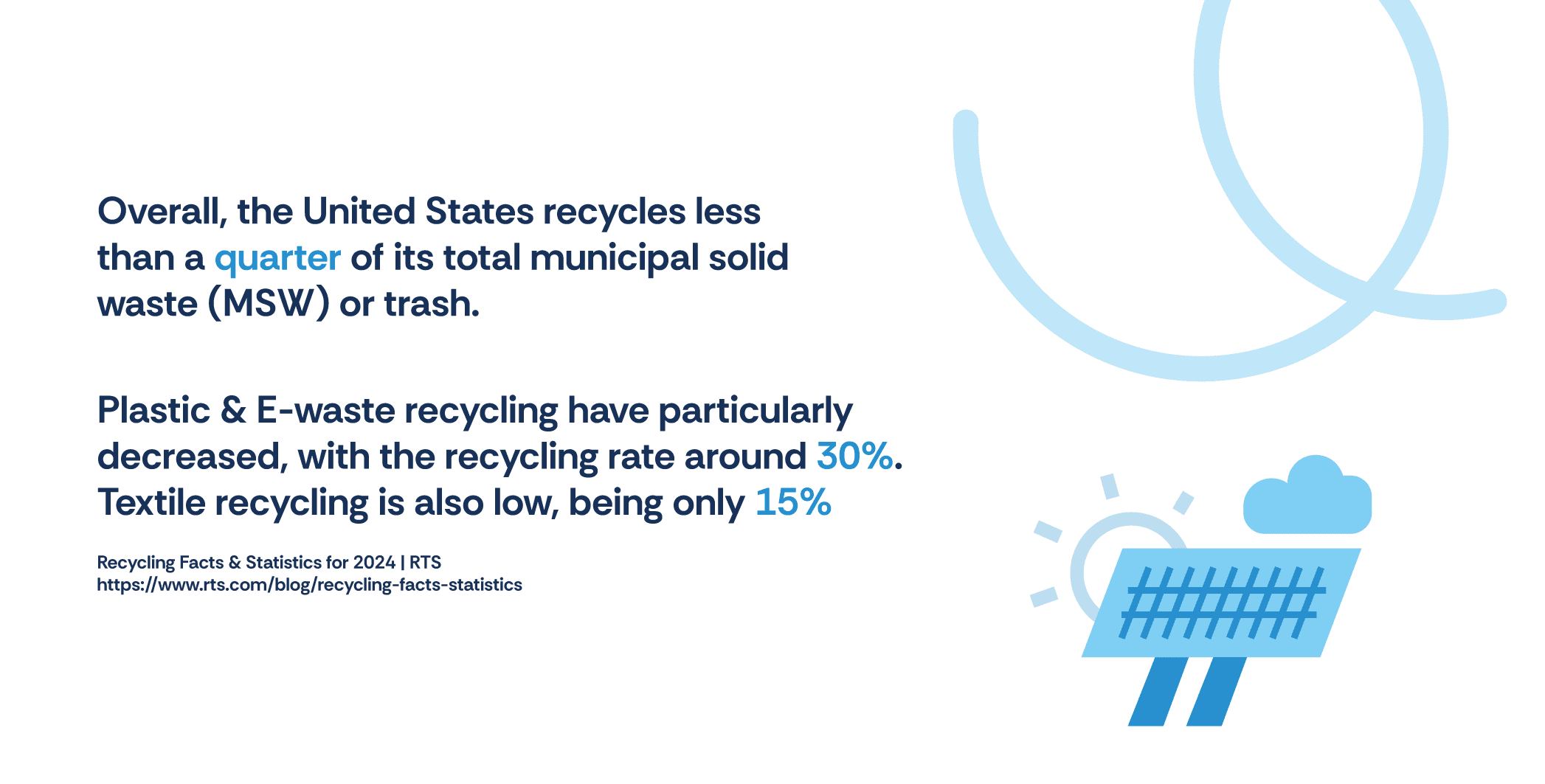
Recycling is essential for maintaining a sustainable environment and keeping our planet as clean and healthy as possible. It's also known that confusion and inconvenience around recycling can lead to lower participation and the incorrect disposal of recyclable items. To combat this, I aimed to make the recycling process easier and more accessible to the average person.
Process & Solution
To combat this, I aimed to make the recycling process easier and more accessible to the average person. My work included leading surveys, user interviews, and comprehensive research. I conducted an in-depth competitive analysis along with establishing an affinity diagram, storyboards, and an MVP. Branding as well as wireframing and the ultimate prototype were also completed. Final prototype can be viewed here
Research
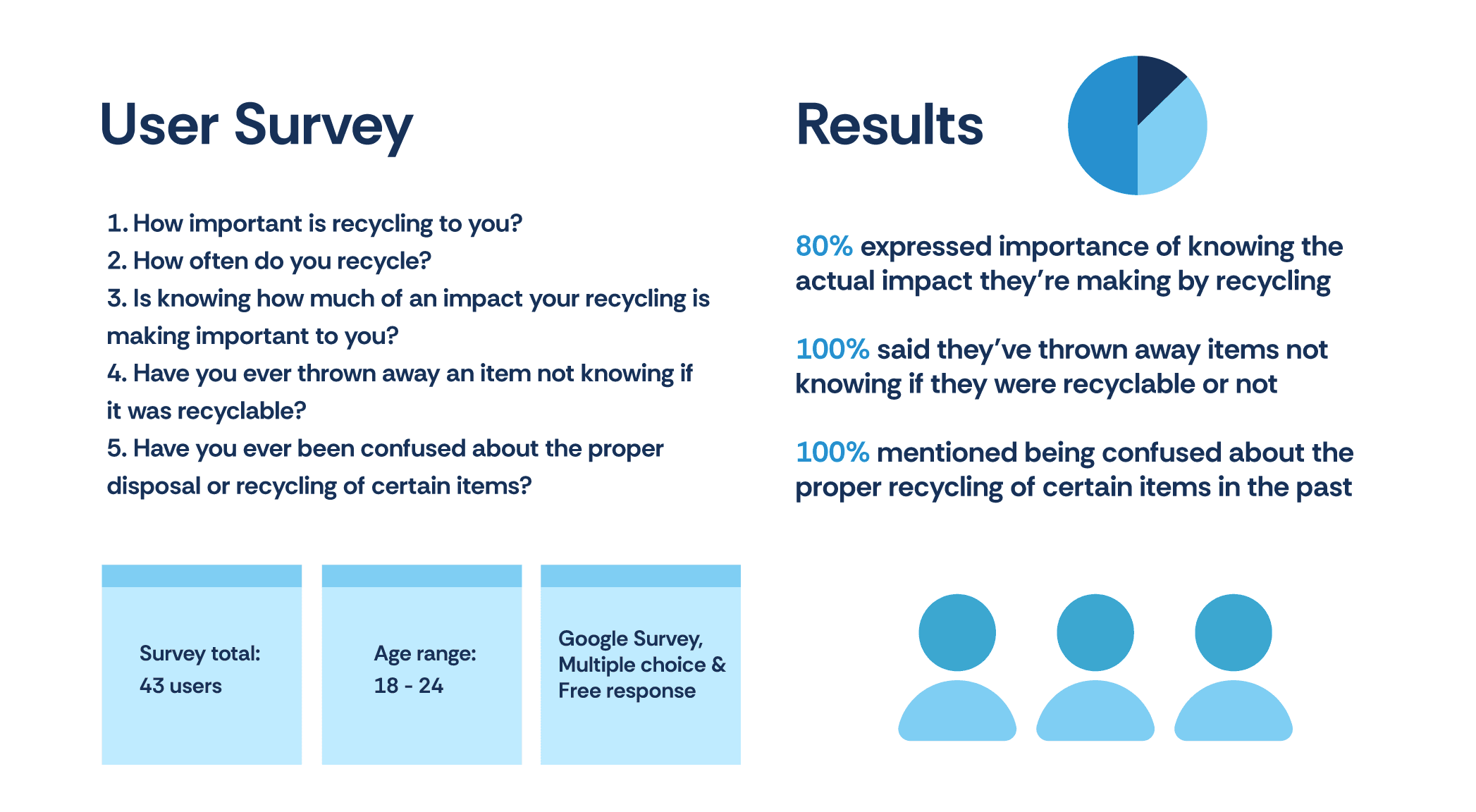
I first identified a general population and conducted a Google survey on recycling practices, barriers, and impact. The survey revealed that many people are unsure of what items are recyclable and often lack the confidence to recycle correctly.
Results showed a need for clearer recycling guidance, with many unsure of what’s recyclable and desiring greater impact awareness to encourage consistent habits.
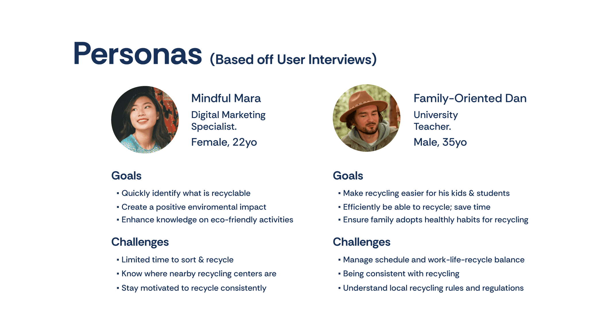
From the survey respondents, I selected two individuals for one-on-one interviews to gain deeper insights into their recycling routines and habits. These interviews provided a more detailed understanding of their goals and the challenges they’ve faced.
By exploring their unique recycling experiences, I uncovered unique perspectives on how confusion, convenience, and a lack of information on recycling influences their behaviors, offering valuable context to the survey findings.
To better understand recycling as a whole, I researched which items can be recycled at home versus those needing special facilities. I discovered that plastic resin codes indicate plastic type, not recyclability, which likely adds to the confusion.
"Wishcycling"—recycling uncertain items—also complicates sorting, raises costs, and can lead to contamination, diverting more waste to landfills.
To learn from currently available solutions I conducted a competitive analysis of the top three recycling apps, examining user flows, key features like item identification and tracking, and overall practicality.
This review highlighted gaps in existing apps (e.g., scan methods, recycling history) and areas where my design could improve by reducing UX barriers.
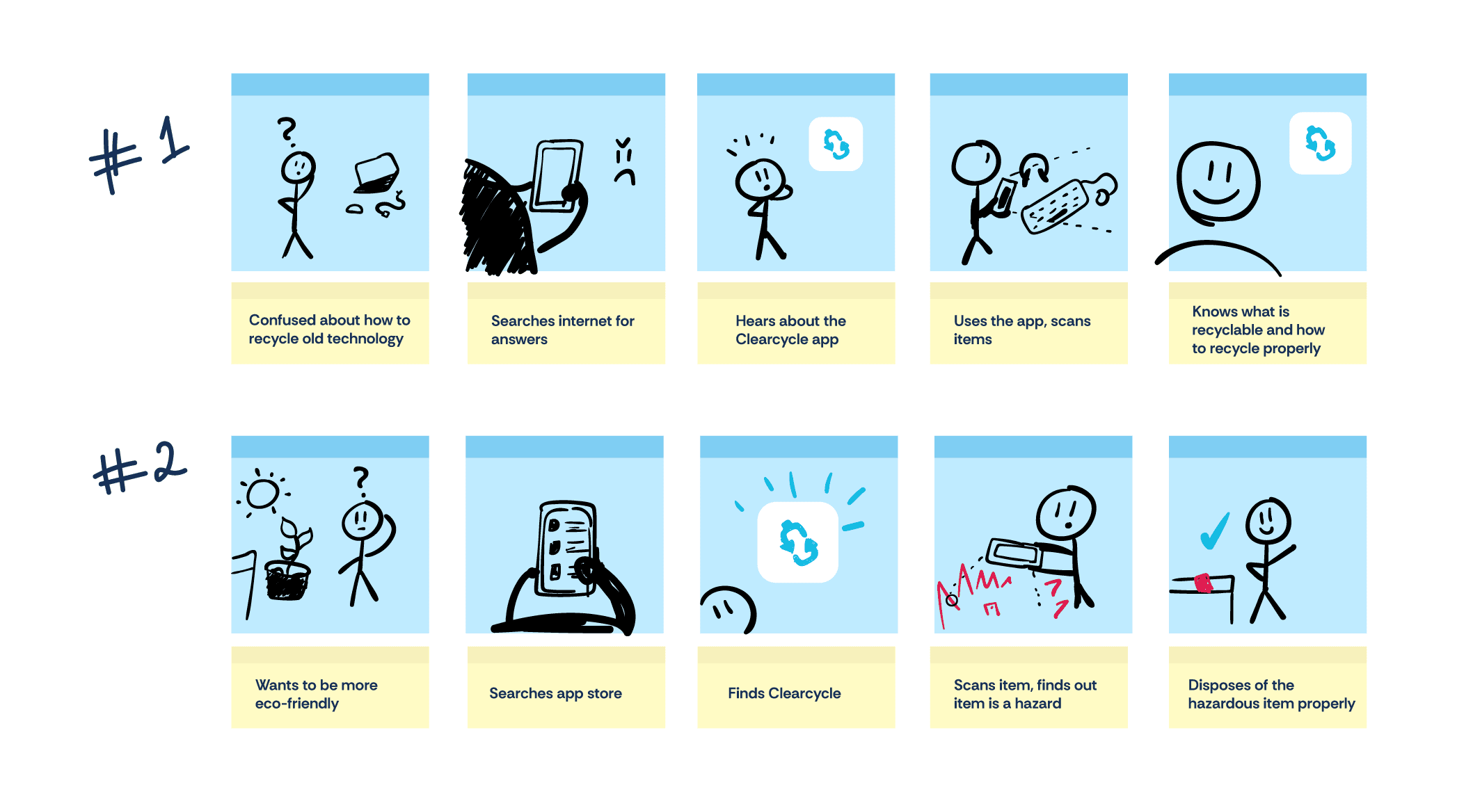
By crafting storyboards I could visualize user interactions with the app, illustrating key steps in the user journey. These storyboards served to identify potential pain points and areas of confusion, allowing me to address them early on.
Simulating real-world scenarios, such as a user scanning an item to check recyclability or to know what's hazardous, the storyboards helped to reinforce core app concepts.
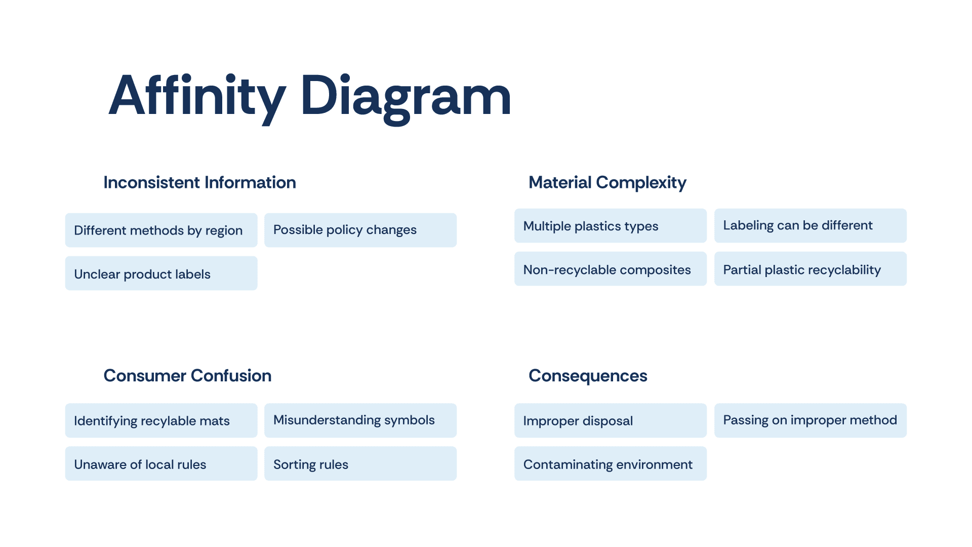
I then created an affinity diagram to organize and analyze topics. This method allowed me to group similar insights and identify recurring themes, such as material complexity, where users struggled to determine what items were recyclable.
The affinity diagram also highlighted the consequences of improper recycling altogether. This structured approach helped me clarify user pain points and provided a strong foundation for defining app features.
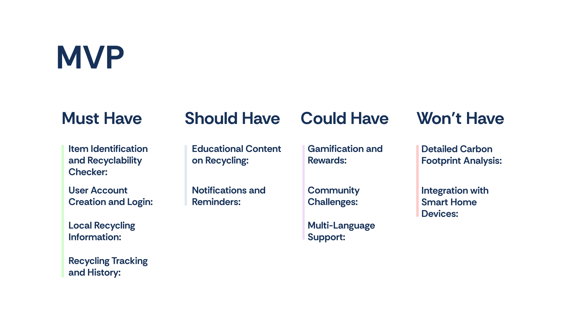
I applied the MoSCoW method to carefully define the scope of the MVP and ensure it addressed the most critical user needs. Key features, such as item identification, were prioritized as Must-Haves to solve the primary pain points identified during research.
Additional features were categorized as Could-Have for future iterations, which allowed the initial design to remain focused and practical.
Wireframes to Prototype
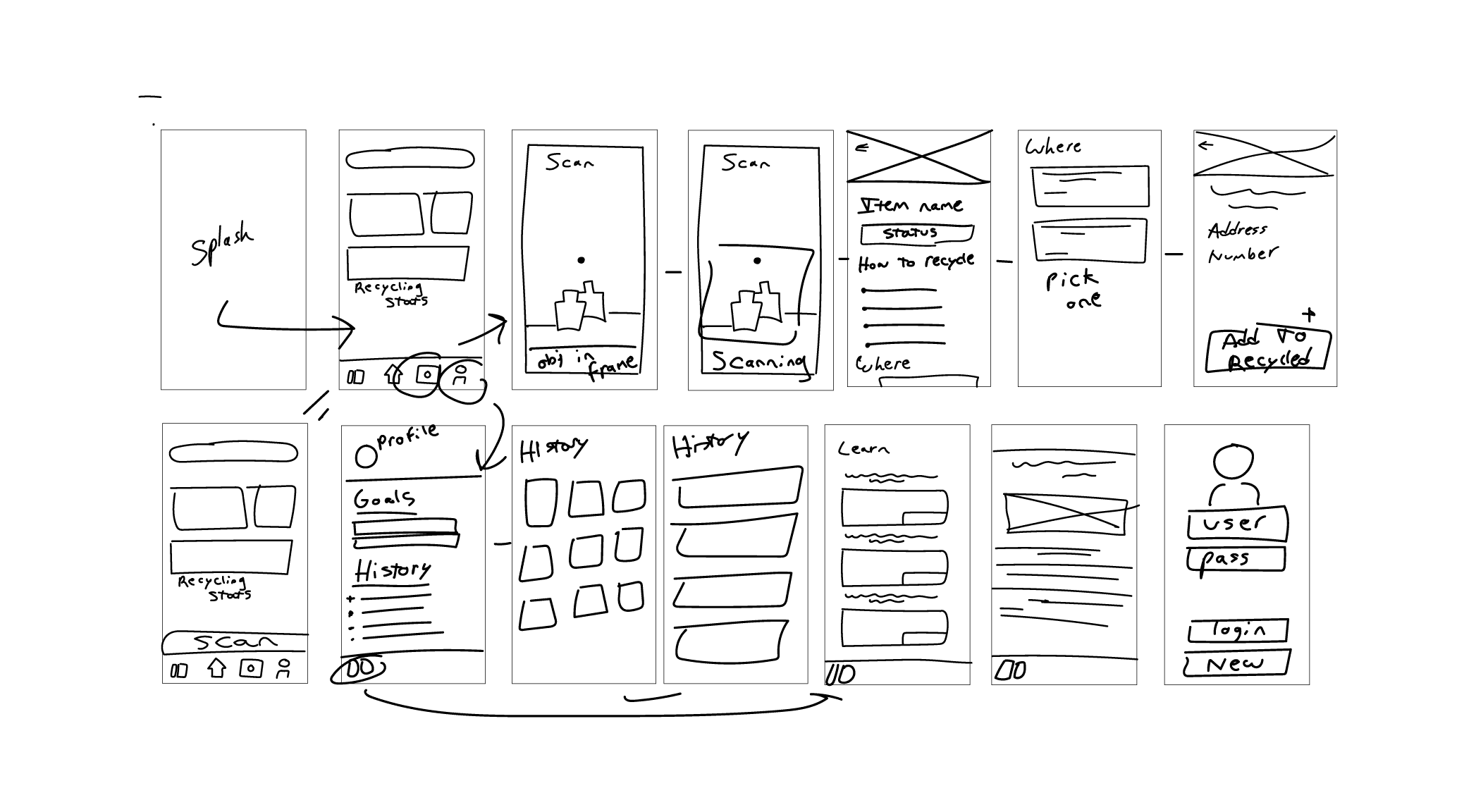
I began sketching wireframes and establishing user flows based off insights which helped to enable effective UX early on. I refined these into mockups focused on core functionality and navigation.
After creating a functional prototype, I tested it with the same survey participants, gathering feedback on usability and areas for improvement. View final prototype
User Testing Rounds
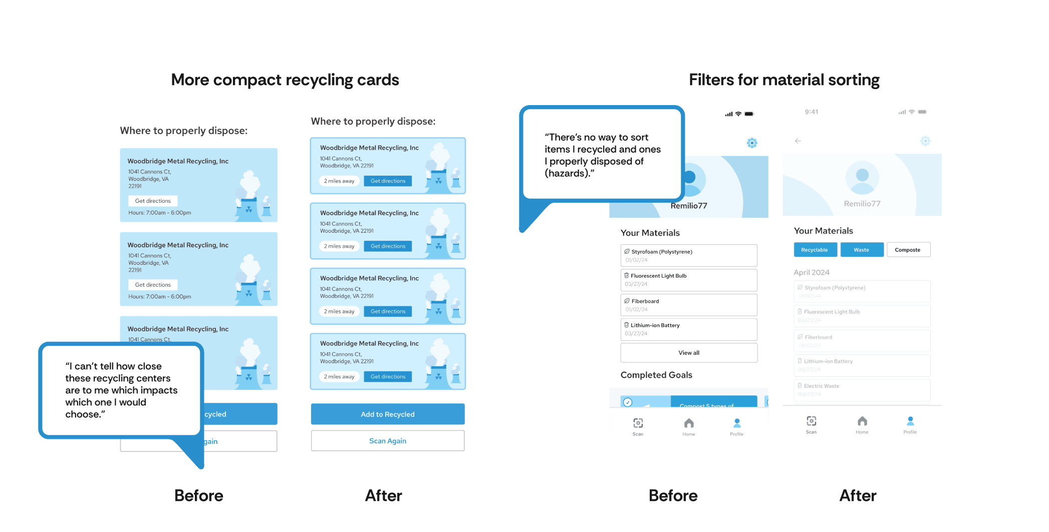
I continued to revise the prototype based on feedback, addressing pain points and refining features for clarity and flow. A follow-up poll confirmed that the changes resolved initial issues, making the app more user-friendly and aligned with user needs.
Final Outcome
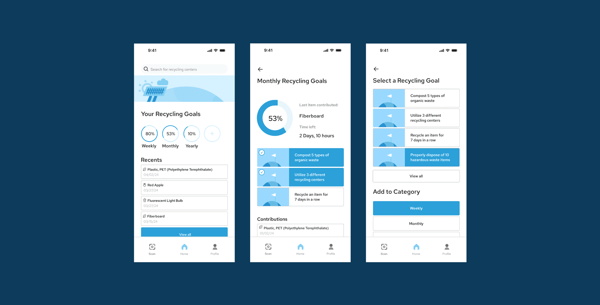
The project resulted in a functional prototype of a recycling app designed to address key user pain points. The app features a user-friendly interface with recycling identification, personalized recycling stats, and item tracking to encourage consistent recycling habits. User testing demonstrated that the app greatly improved users’ confidence in identifying recyclable items and increased their motivation by features such as showing their environmental impact.
Takeaways
Survey Participants & Testers
Being able to utilize the same people from the initial survey to also test the final prototype allowed for more valuable insights that contributed to the overall effectiveness of the app. This approach led to a design that more accurately fit their daily needs, highlighting the value of engaging with users fully for a truly resonant product.
Refining with Competitive Edge
An in-depth competitive analysis revealed strengths and weaknesses in existing recycling apps, allowing me to incorporate effective elements and to avoid UX flaws. This approach saved time overall and led to a more functional app from the start. It made me realize the importance of having competition to learn from.
User-Driven Refinement for an Engaging Prototype
Building a prototype and gathering feedback enabled rapid, user-driven improvements, allowing the app to constantly evolve. Users were positively receptive to this, which inspired me to continue with iterative design and real-time feedback for future projects.
